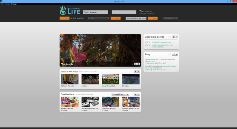
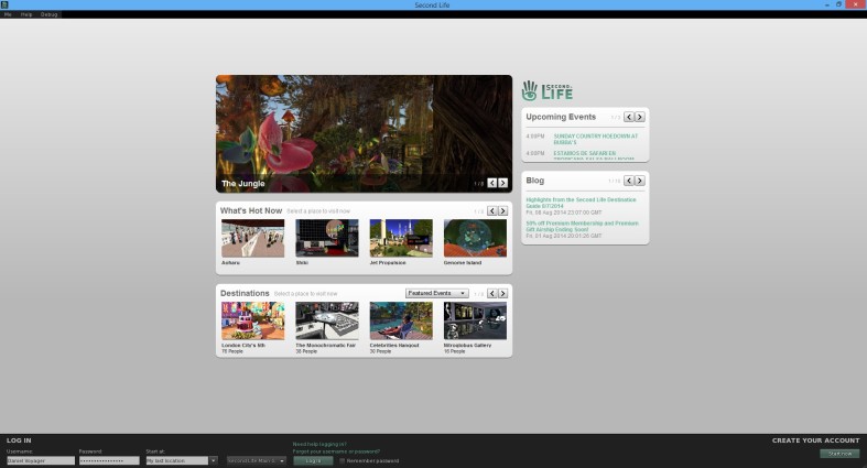
Linden Lab has revamped the Second Life viewer login screen this week to make it more simple and cleaner for new users apparently. To see the new changes download and install the latest release via the Second Life Release/3.7.14.292660 release notes page.
From a glance the login area has been moved to the top of the screen with three new login buttons to enter Second Life. The login area has been enlarged with a new look and its more welcoming than before in previous releases of the Second Life viewer. The showcase area below is still the same as before and the logging in process is still the same.
What do you think of the new login screen ?


How odd. I’ll get used to it, sure, but having *three* “Log In” buttons looks like some bad UI to me.
LikeLiked by 2 people
It’s strange yes but it now automatically logs you in when you choose last location or favourite places or the type in box.
3 simple ways to log into Second Life is the key message here I think. lol
LikeLike
If three log in buttons is better, why not six? 10? I really do think this needs to be cleaner.
LikeLiked by 1 person
Three buttons might be easier to comprehend. Many experienced users I know were not aware that one could change their startup location via a drop-down or by typing it in (like when you want to log in at Pooley you’d simply type in that sim name).
LikeLike
Let’s hope it works as a maximized (not Full Screen) window on OS X. Setting to full-size would change the mapping of links so clicking one to visit a feature location was seldom successful.
LikeLiked by 1 person
I agree, Uccello. *nods*
LikeLike
Nope. Running maximized still changes the mapping. To click a particular button one has to click the button to its left or the blank screen to the immediate left.
LikeLike
I sort of like the multiple login buttons. Their placement could be more balanced, but, I can’t quite knock having options right up front. (^_^)
If anything… I’m very pleased that the login bar is now set above cat level. 🐱
LikeLiked by 1 person
@Imnotgoing: It will take some time getting used to after having the login bar at the bottom for so many years. 3 login buttons to make it simple and easy to log in will work for many for sure.
The new login screens looks similar to the SL Go layout and I think the showcase boxes should be larger because there is so much empty space.
LikeLike
Three login buttons is completely ridiculous! I’m not a UI/UX professional, but this just looks like a horrible idea, making it more complicated/error prone than the easy to understand old screen. I don’t think that this change will drive me crazy, but I think it’s a horrible idea.
Having a single button with a single dropdown location selector made it easy to choose your destination and guaranteed that the only location shown on the screen is the place you will be sent. Adding three locations and three buttons increases the complication in this task, requiring you to process the choice in triplicate.
LikeLike
I’ve already screwed up. After choosing a new location I tapped the Enter key and wound up logging in Last Location instead.
LikeLiked by 1 person
Yes, one button is all that is needed. I think three is rather too extreme for new users.
LikeLike
I think Linden Lab should reduce their prices instead of redesigning something that isn’t broken.
LikeLiked by 1 person
I agree, the loss trend is still happening in terms of weekly region losses.
LikeLike
I am glad they are looking at things that make it easier, especially putting the log in at the top, I am sure it will probably help those with visibility issues, and new users as it is more in keeping with starting from the top. As for the three buttons, it is more often than not I forget to change the drop down and end up at home instead of last location, so if there button is right there then YAY…I know I can change that in my preferences to be last location always, but it is not always that you need it. Maybe it would make more sense if they had different colours, to some.
Thank you Daniel 🙂
LikeLike
Thanks Sasy
LikeLike
Its silly to have three separate login buttons. I know now beginning users, and even others, will now have to read the screen every time to see where they should press. Its a bit daft. It should be changed to ONE GUI action button, but can have selections for the choices so long as the last chosen one is kept. oh.. wait, that what they had before 🙂
LikeLike
Just have one button and add more to the empty space on the login screen would be good to see happen soon.
LikeLike
I hope Firestorm does NOT adopt this style and cause confusion for our users on OpenSim. This is an over complication, not a simplification in my view.
LikeLiked by 1 person
So far its just this release as I can tell.
LikeLike
What is the thing that says Phoenix Firestorm is that a group? Anyway, It doesn’t seem easier to use, it looks more complex. But it doesn’t matter I guess, I will just wait for it to be on the main release because it’s not particularly useful.
LikeLiked by 1 person
Thanks Terri
LikeLike