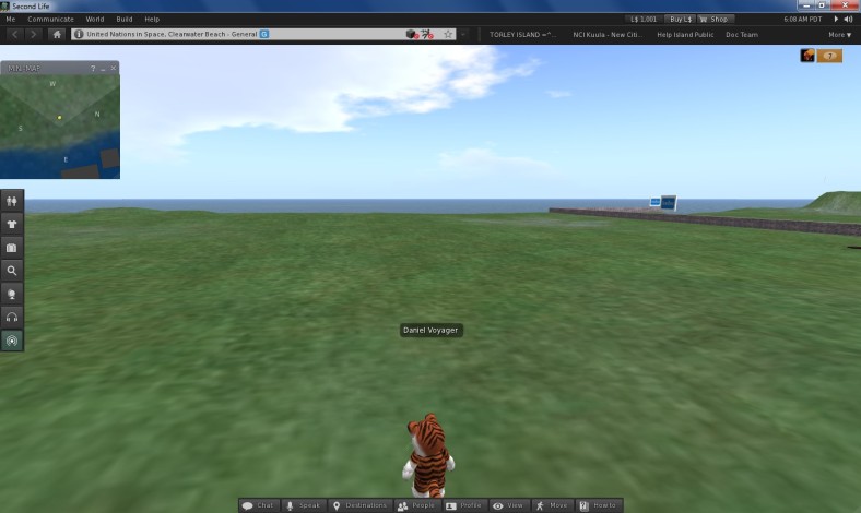
On 18th October 2011 Oz Linden added a new Beta Candidate to the SL wiki Downloading test builds page. Viewer 3.2.0 beta viewer now has a new user interface which looks good. Today I downloaded and installed the new beta version which seems to working fine on my pc. I like the customization and the new features added in this release.
When I logged in I noticed that there was no sidebar and that’s because Linden Lab have replaced it with new customized panels. A big majority of SL users wanted the sidebar to be removed in the early releases-recent releases of Viewer 2 and now most of which have moved to third-party viewers instead. Many liked Viewer 1 for many reasons and now with this new release perhaps users will start returning to Viewer 3.
New changes
- New panels have been added left of the viewer and at the bottom
- New Avatar picker added to left panels
- Notifications now appear top right of the screen
- New Received Items in Inventory > when purchasing things from the marketplace
- Dashboard & Toolbars added to the Me menu
- New Destinations Guide on the bottom toolbar
- Shop button added to top toolbar
- There’s much more!
The new Viewer 3 user interface
Looking at the new Avatars picker
Dashboard & Toolbars have been added to Me menu
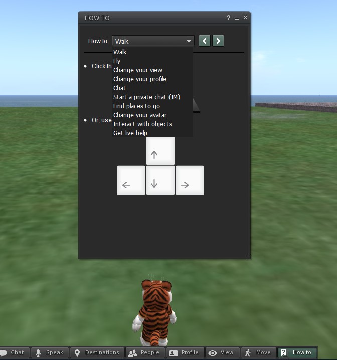
New How To basics
New Destinations Guide
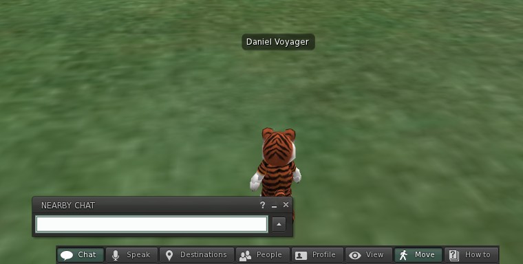
Basic Chat bar
Here are some mixed reactions from the SL community about the new Viewer 3 user interface.
Likes
- I like it
- It looks good
- Looks promising
- It’s running pretty smoothly
- Not happy with another change
- Not so good for performace
- There are significant bugs
- Slightly behind firestorm with regards to the toolbar/ sidebar


ok, i just did sort my most used buttons, i didnt no what i saw first place , but not a bad idea to let people deside wish side they want buttons and wish buttons, only problem i have now is that IM and group boxes show top right screen , and thats just the place where i have a hud, and i miss alot ims now not used to look on top screen, it would be nice if we could place that to where we want ( or i did miss that part, but i cant find it now ) and i miss the option to chat public in the main, now im forced to chat in a box wish covers my screen for a part as whel again
but so far its not bad at all ,
LikeLike
Thanks for the comment!
LikeLike